BRAND IDENTITY / FEATURED PROJECT
STAINBYE
A little mess. A more considered solution.
- INDUSTRY
- Lifestyle / garment care
- WHAT WE DID
- Visual identity · Packaging design · Product labels · Brand collateral
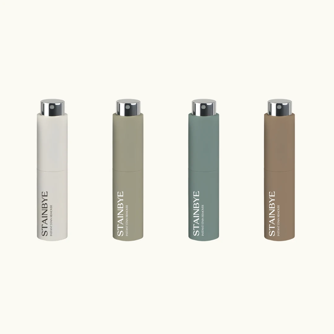
THE PROJECT
Everyday care.
An elevated identity.
STAINBYE brings portable stain removal into everyday life. The identity gives this practical product a calm, considered presence, making garment care feel like a natural part of what you carry, keep and reach for.
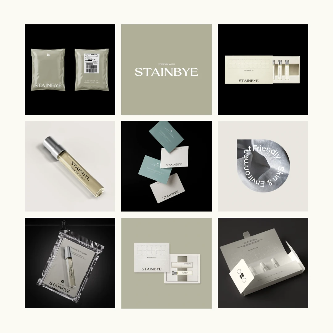
A distinctive serif wordmark, a soft four-petal symbol and a restrained palette create a recognisable visual system. Cream, olive, muted teal and taupe connect the product range, while a repeating line pattern adds detail across boxes and printed pieces. The message “Standby with STAINBYE” gives the brand a simple, reassuring voice.
01 / PACKAGING EXPERIENCE
Practical inside. Considered throughout.
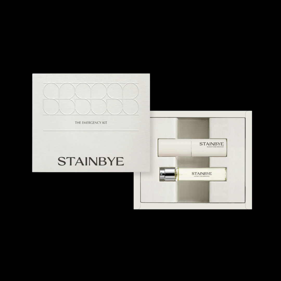
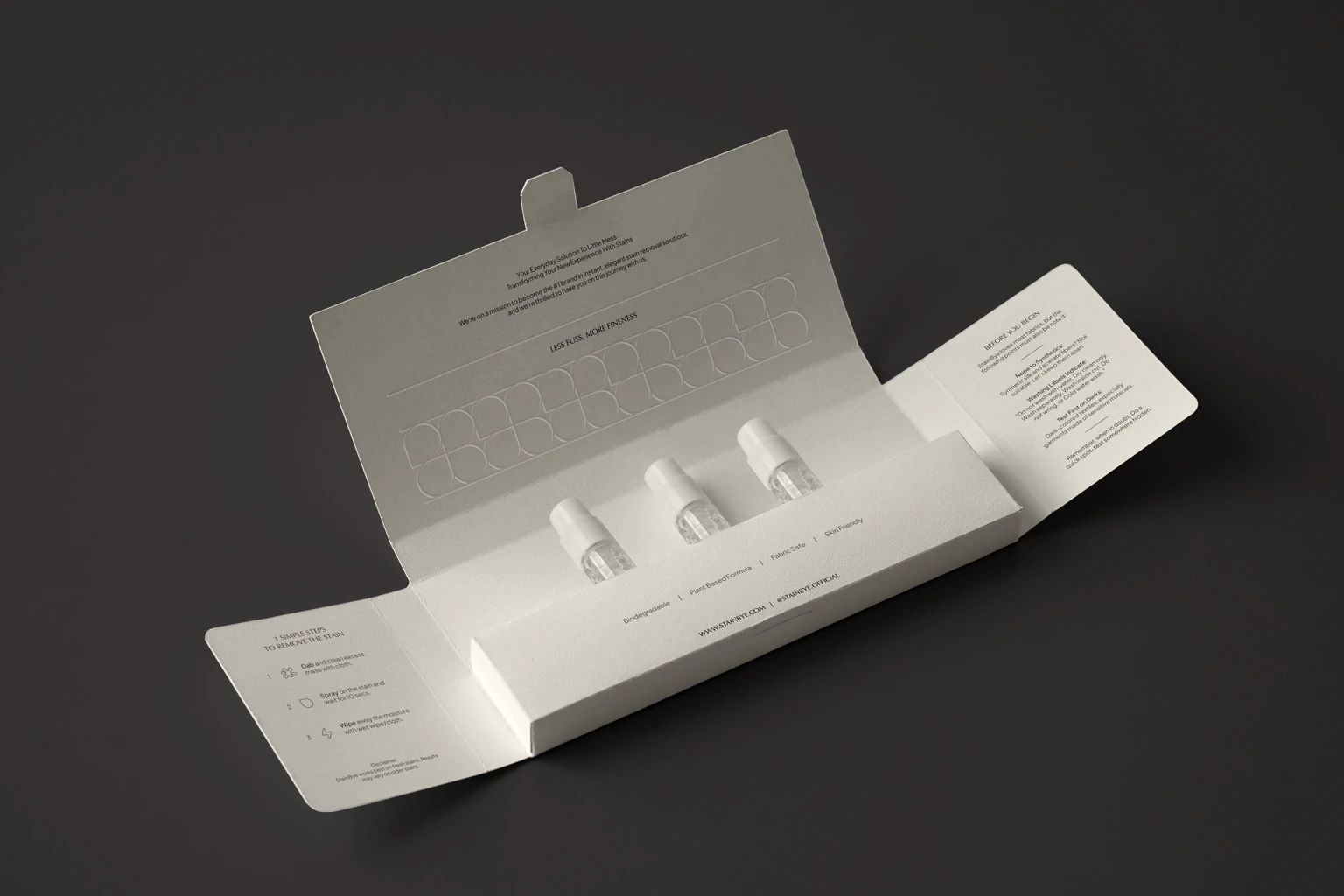
The emergency kit and fold-out carton turn functional packaging into part of the brand experience. A restrained exterior, subtle pattern and organised interior create a clear sequence from opening the box to finding the product and its instructions.
02 / FIRST IMPRESSIONS
From the first sample to the doorstep.
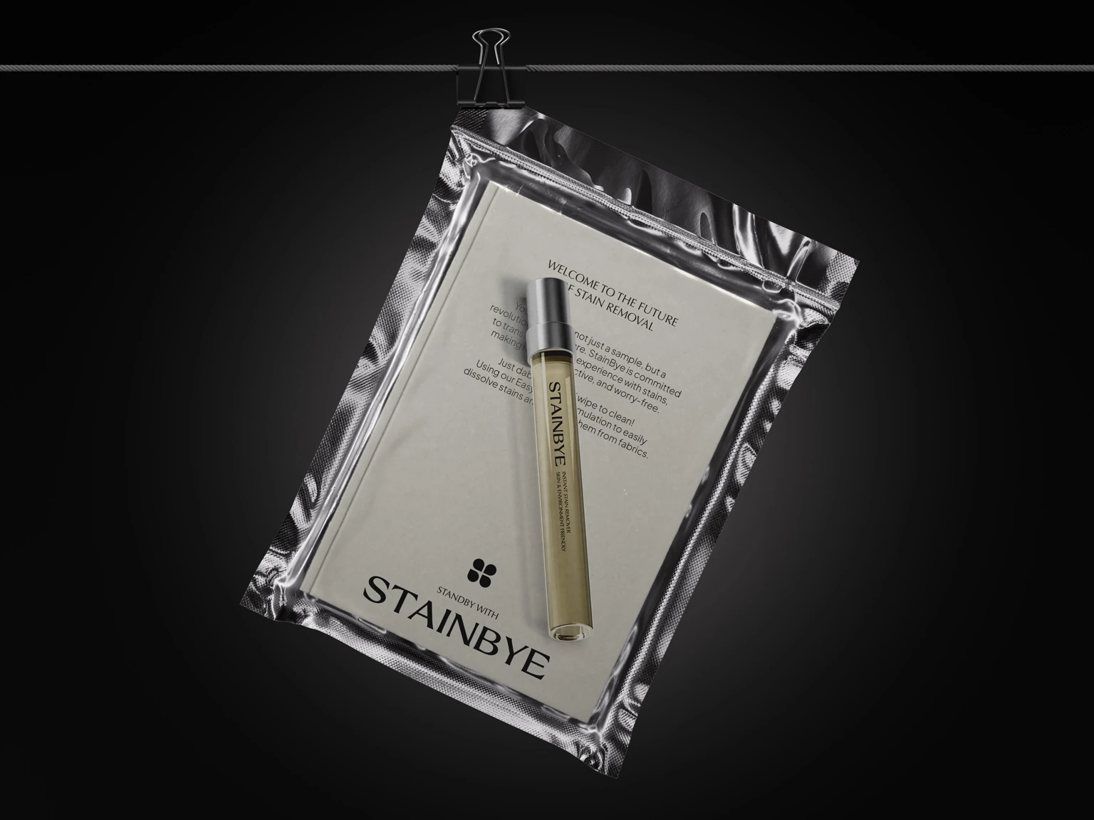
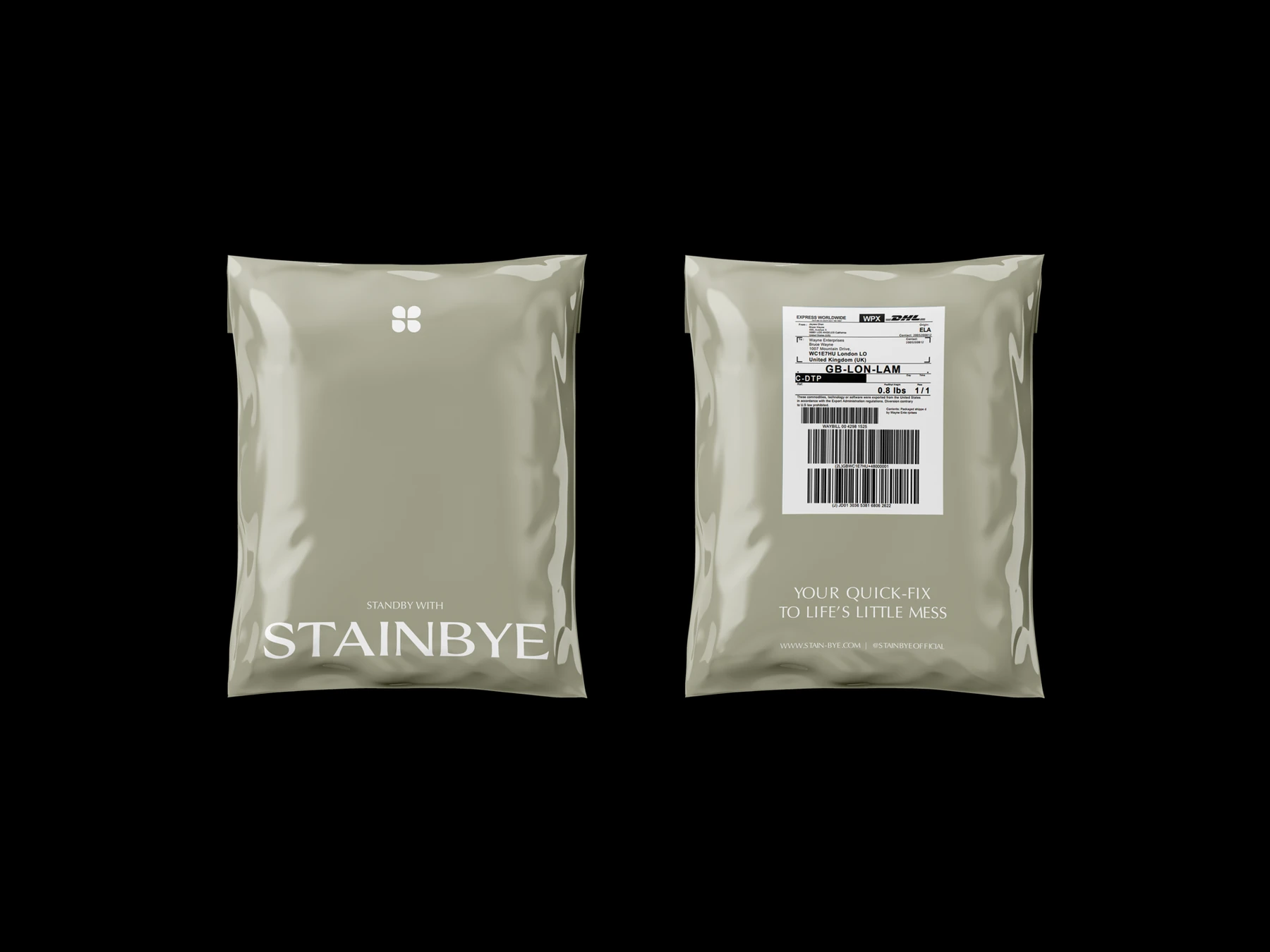
The identity adapts to different formats without losing its character. A silver sample pouch gives the product a focused introduction, while the olive mailer carries the same symbol, typography and reassuring tone into delivery.
03 / BRAND CONNECTIONS
A consistent voice in the little details.
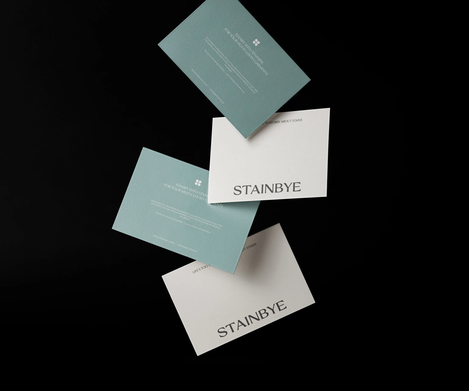
Thank-you cards and supporting applications extend the palette and typography beyond the product. Together, they create a cohesive world for STAINBYE: practical, composed and ready for life’s little messes.
YOUR NEXT CHAPTER
Give your business
a brand of its own.
Explore our packages or tell us what you have in mind.