BRAND IDENTITY / FEATURED PROJECT
Gingkyo Clinic
Simplicity. Healing. A sense of calm.
- INDUSTRY
- Beauty / aesthetic clinic
- WHAT WE DID
- Naming · Brand strategy · Visual identity · Brand messaging · 3D visualisation
THE BRIEF
A new clinic.
A calm, distinct identity.
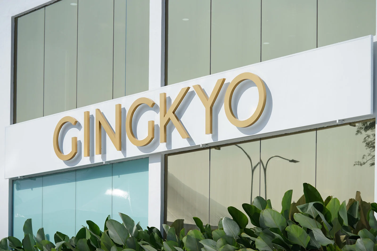
Gingkyo Clinic needed a name, logo and brand messaging for a Japanese-inspired aesthetic-clinic direction. The goal was to give the new brand a distinctive identity rooted in its intended experience.
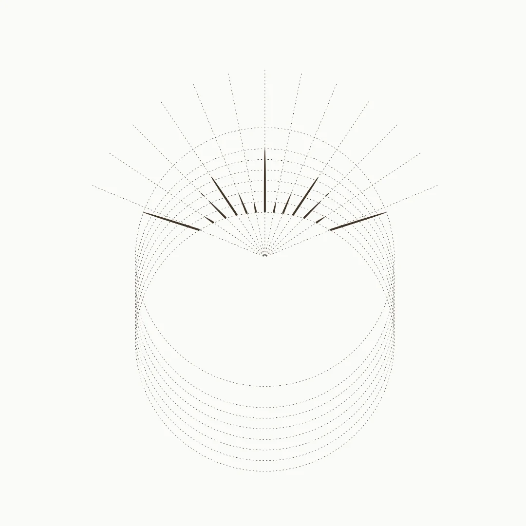
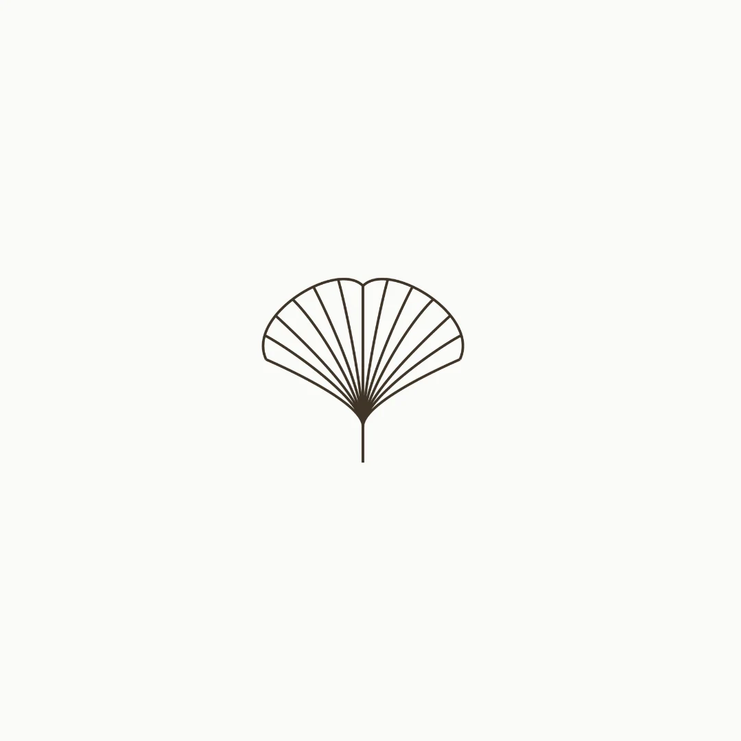
The logo brings together the ginkgo tree and the idea of individual beauty. A grounded palette and considered applications translate that concept into a calm, cohesive brand world.
01 / LOGO & CONCEPT
A symbol of renewal.
The ginkgo-inspired identity connects longevity and rejuvenation with a clear visual symbol and considered typography.

02 / BRAND WORLD
A quieter kind of confidence.
The colour and visual direction carry the calm, Japanese-inspired character into the wider identity.
03 / APPLICATIONS & EXPERIENCE
From concept to touchpoint.
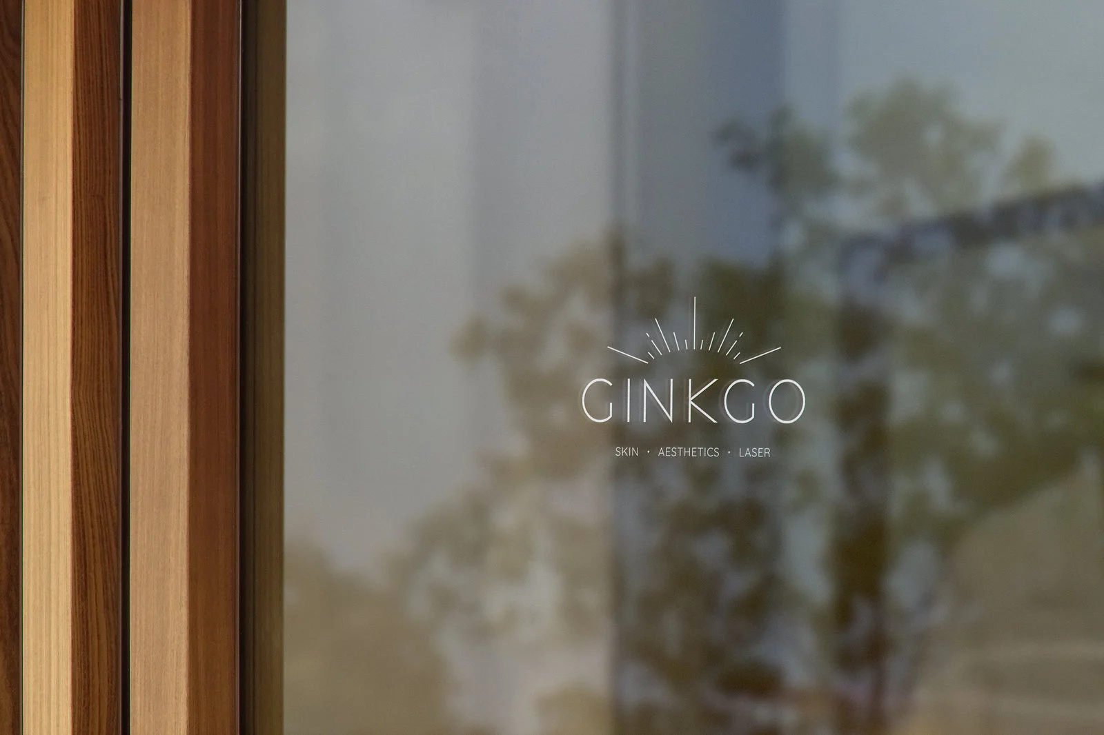
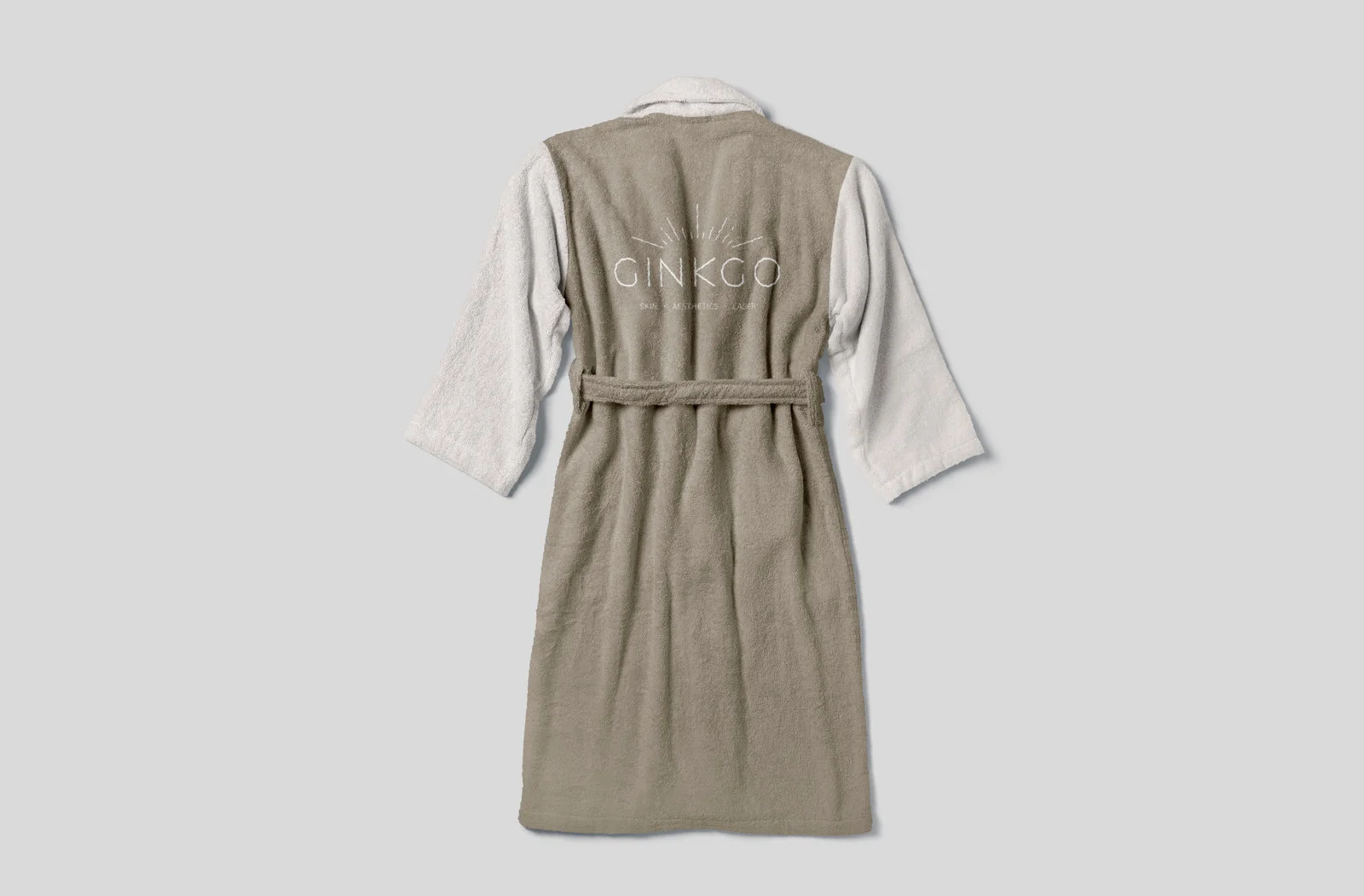
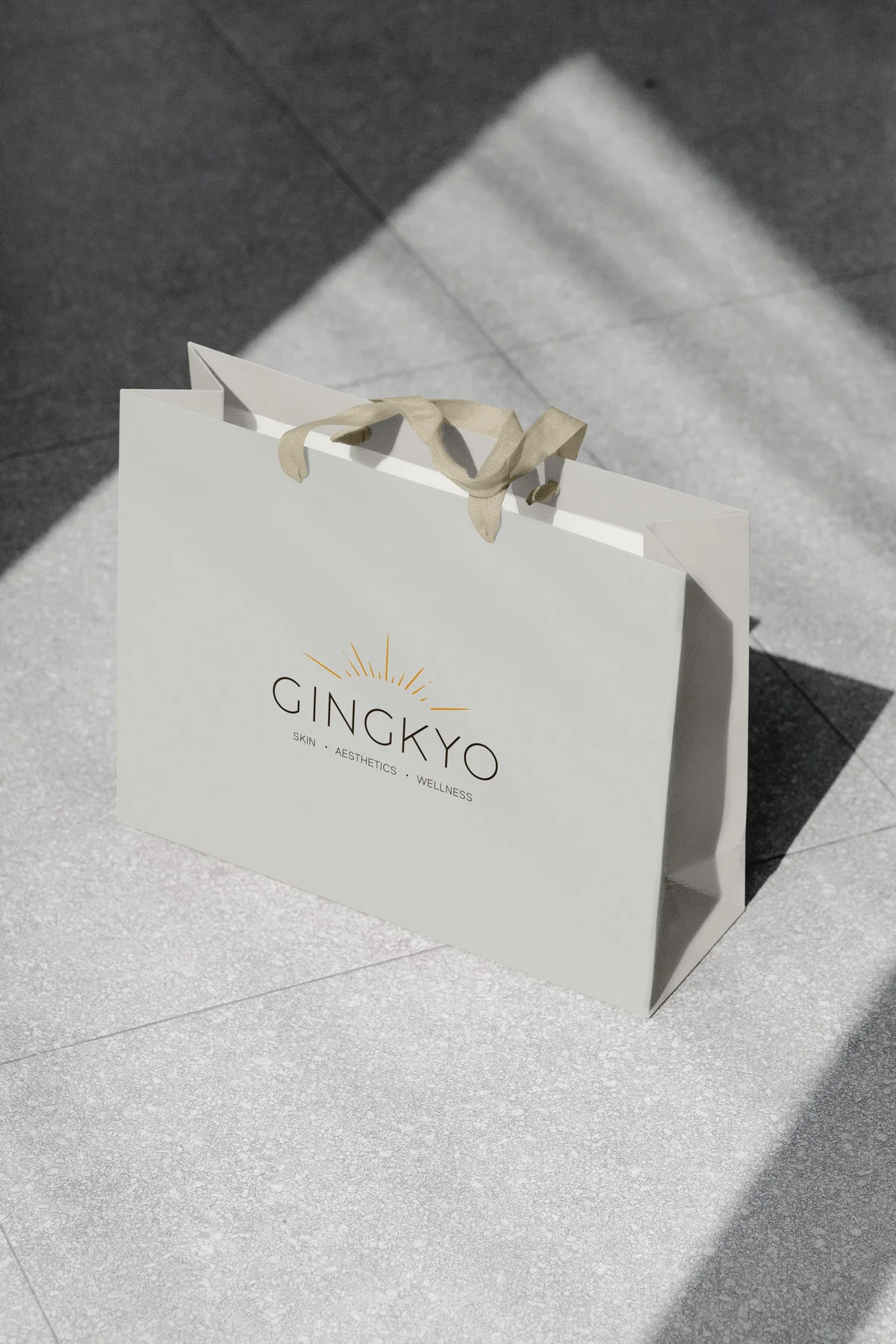
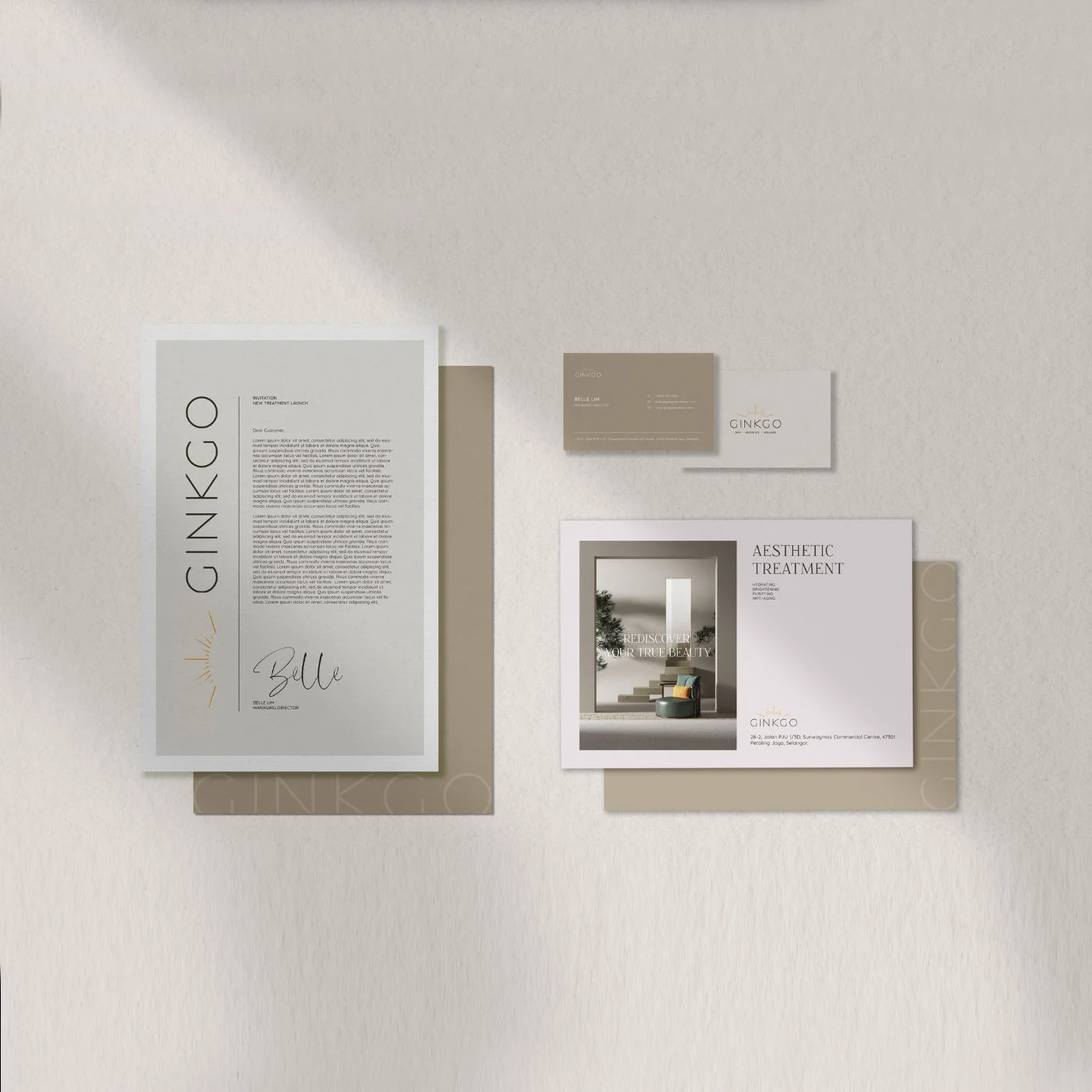
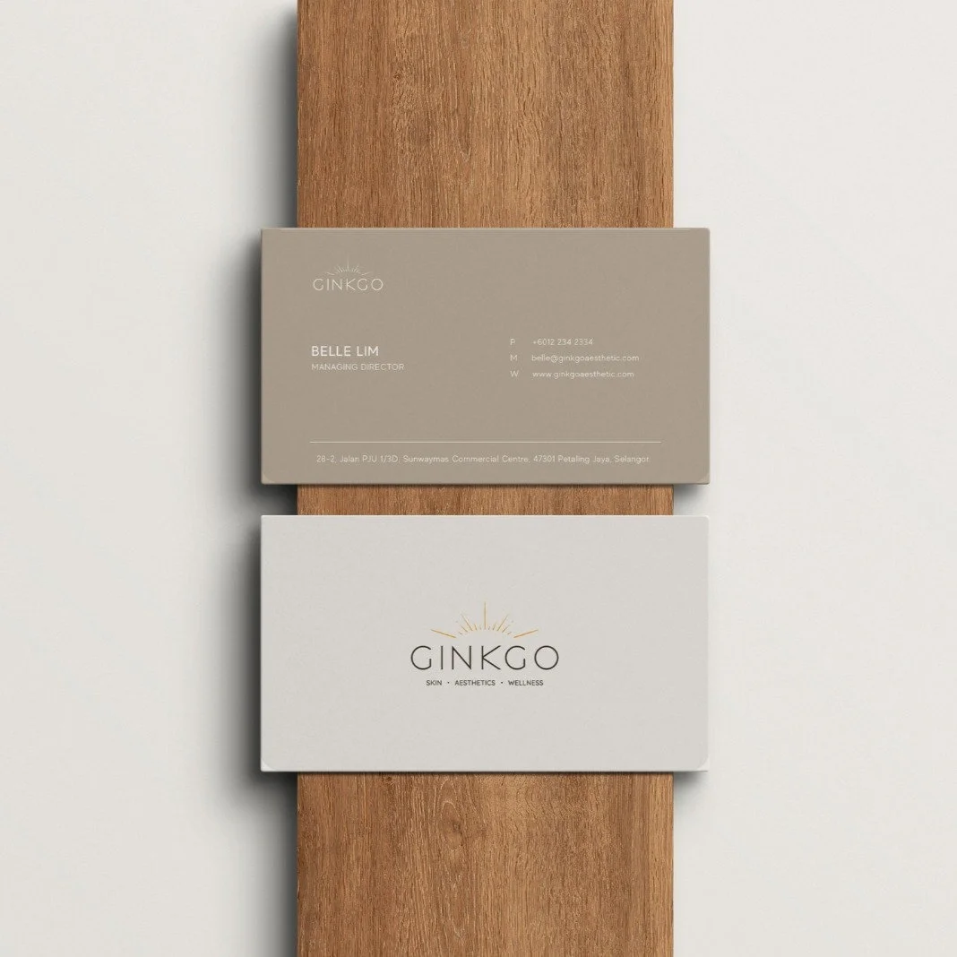
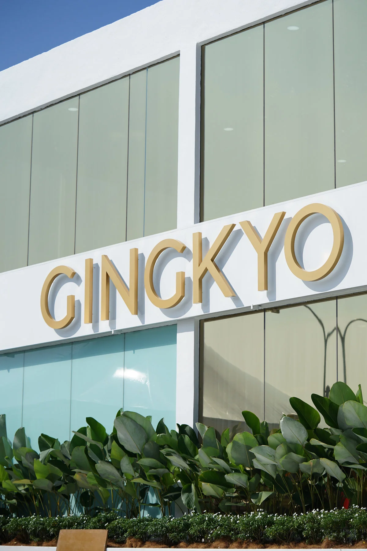
Brand applications and visualisations show how the identity can extend into printed materials, service details and the clinic environment.

YOUR NEXT CHAPTER
Give your business
a brand of its own.
Explore our packages or tell us what you have in mind.