BRAND IDENTITY / FEATURED PROJECT
REVIVO
Energy, with a sharper point of view.
- INDUSTRY
- Beverage / sports nutrition
- WHAT WE DID
- Brand identity · Packaging direction · Visual system · Brand voice
THE BRIEF
An active category.
A distinct kind of energy.
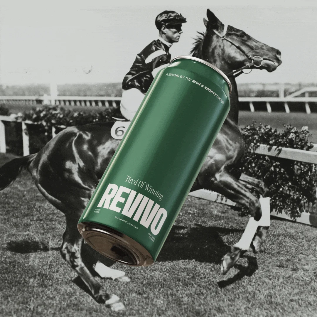
REVIVO set out to enter the sports-drink category with a cleaner, sharper identity. The challenge was to communicate modern athleticism without overwhelming the product.
We developed a visual system with purposeful typography, clear flavour differentiation and a focused brand voice. The direction brings energy and restraint together.
01 / VISUAL IDENTITY
Built around movement.
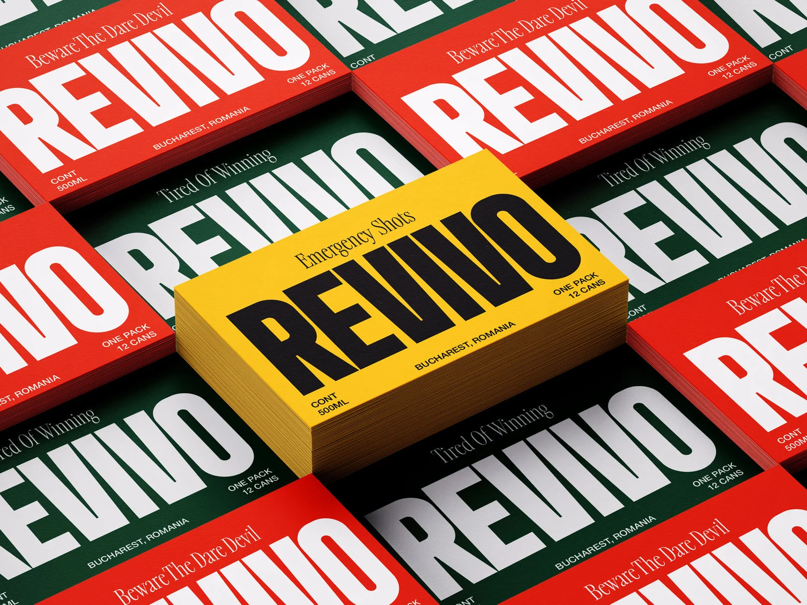
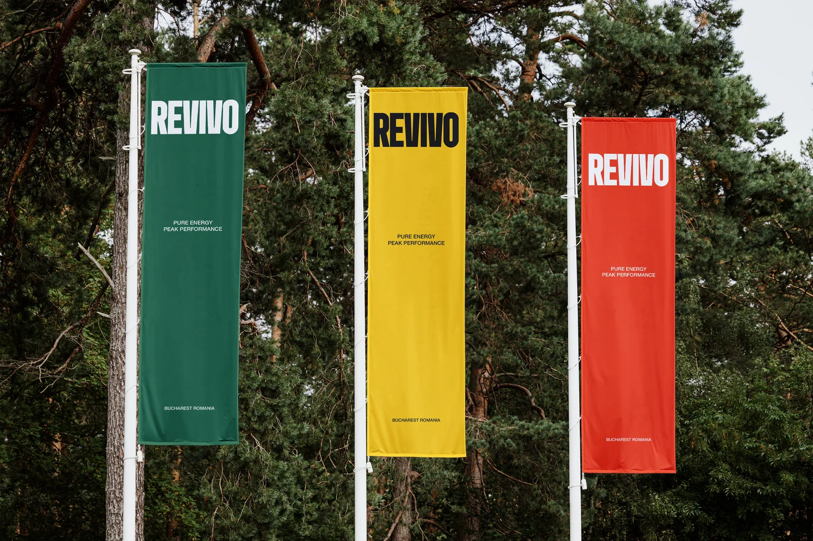
A sharp wordmark and a focused visual language give REVIVO a confident presence across the brand system.
02 / PRODUCT FAMILY
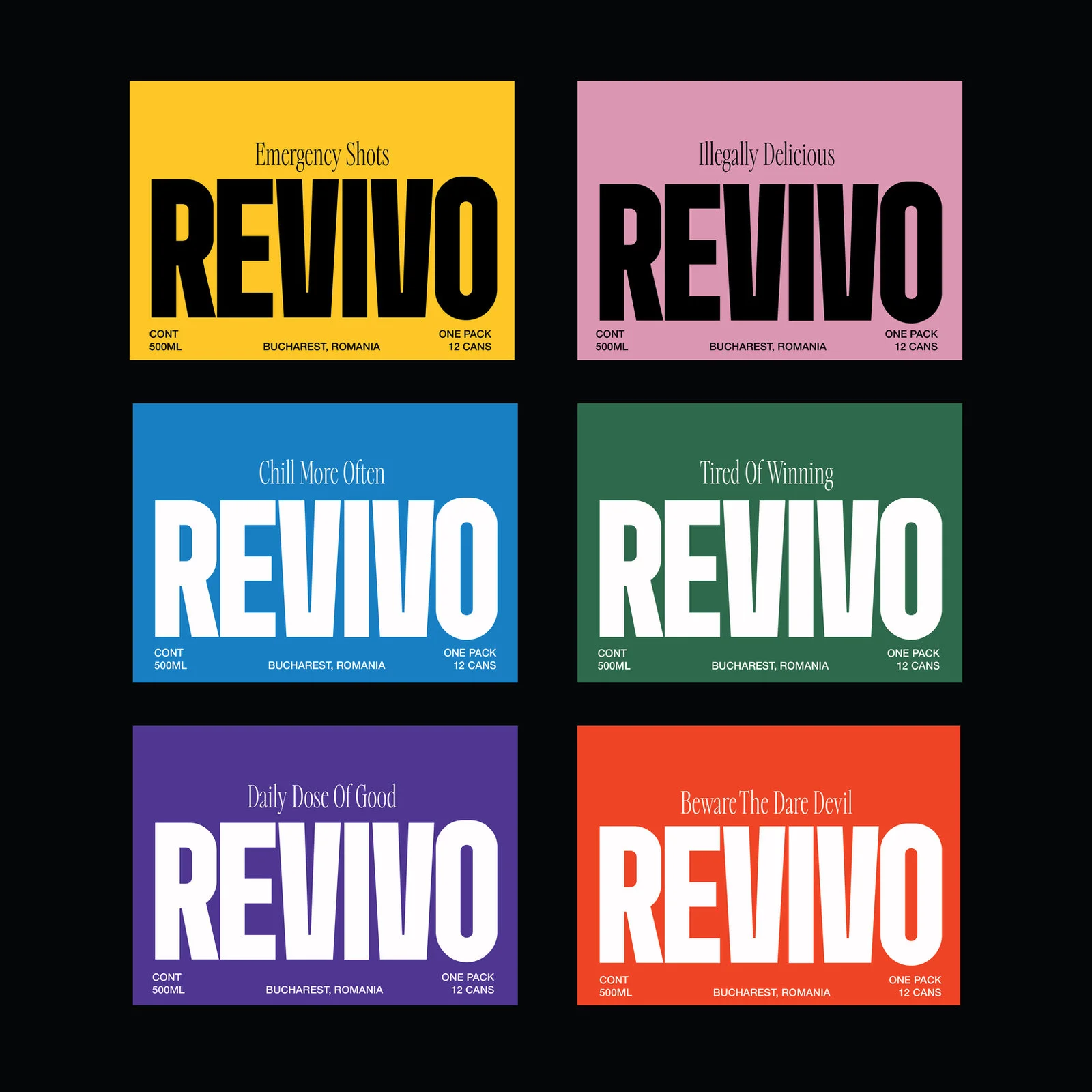
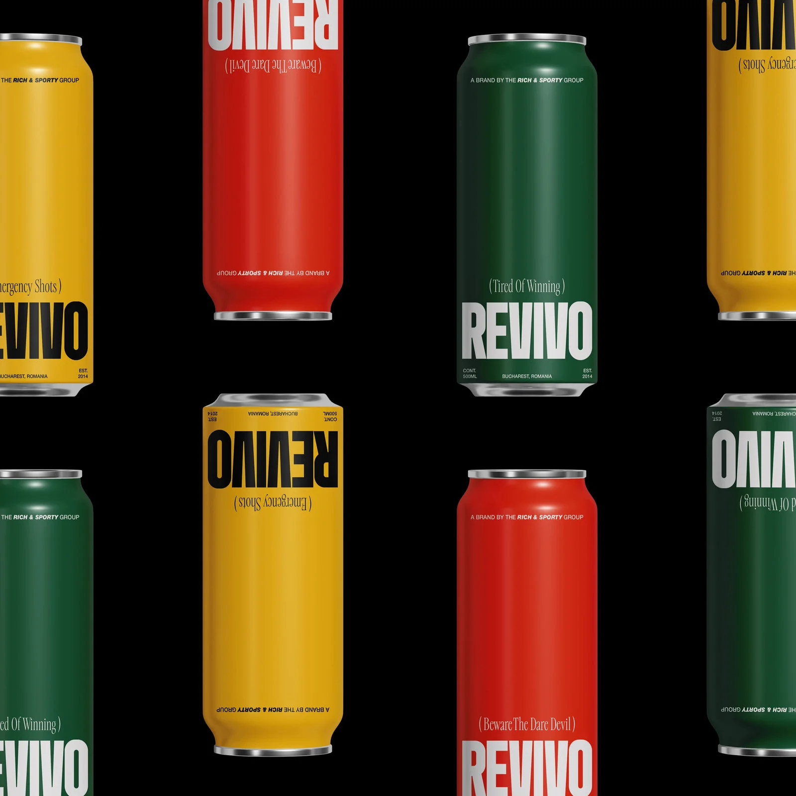
Different flavours. One identity.
The packaging system connects the range while giving each flavour its own expression. Consistent typography makes the family recognisable.
03 / BRAND EXPRESSION
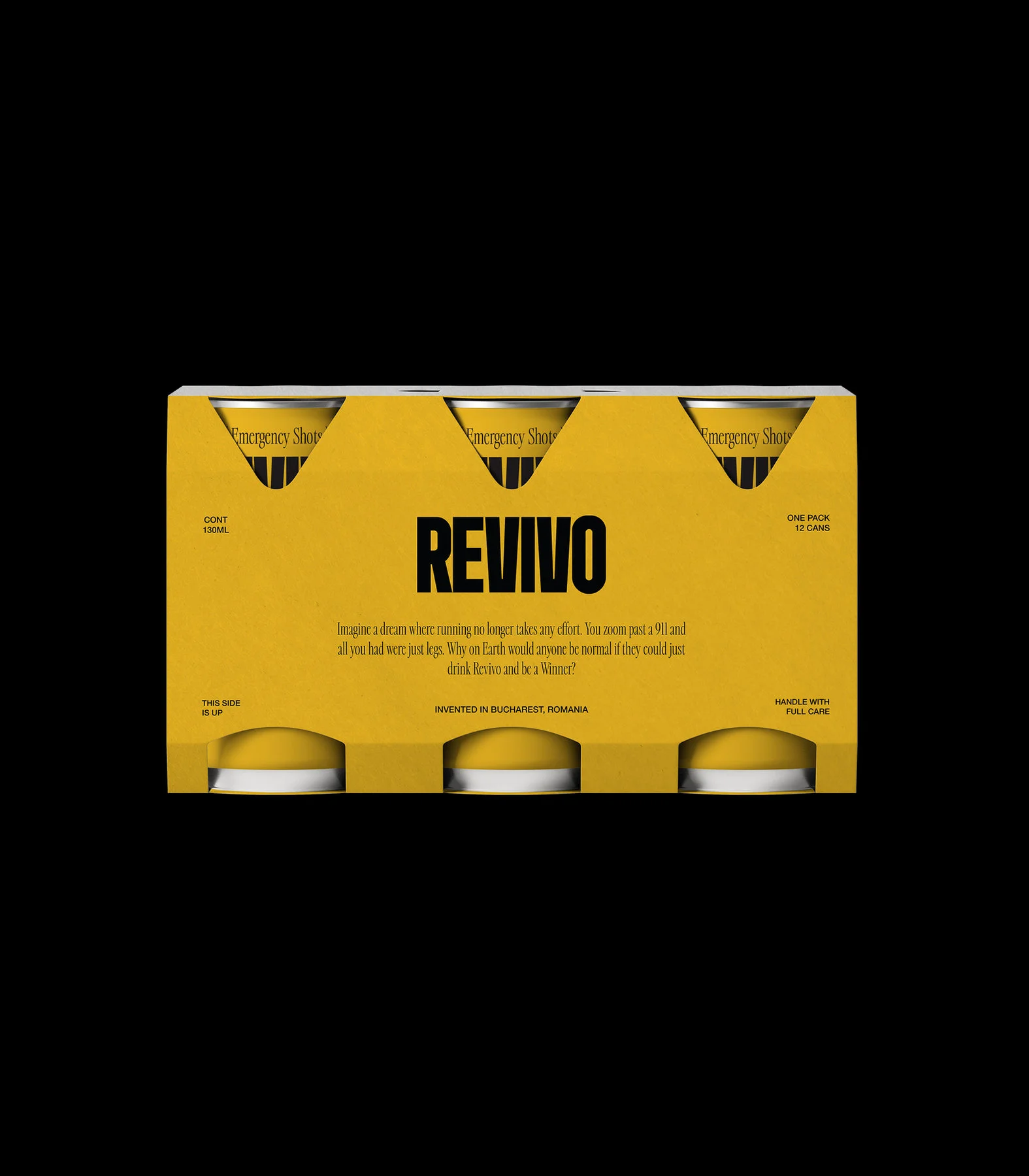
Ready to meet the world.
The identity carries into product compositions and campaign imagery, creating a consistent point of view beyond the can.
YOUR NEXT CHAPTER
Give your business
a brand of its own.
Explore our packages or tell us what you have in mind.