BRAND IDENTITY / FEATURED PROJECT
VOID & VESSEL
An identity with room to breathe.
- INDUSTRY
- Architecture / spatial development
- WHAT WE DID
- Brand identity · Brand messaging · Print collateral · Digital design · Environmental graphics
THE PROJECT
The luxury
of subtraction.
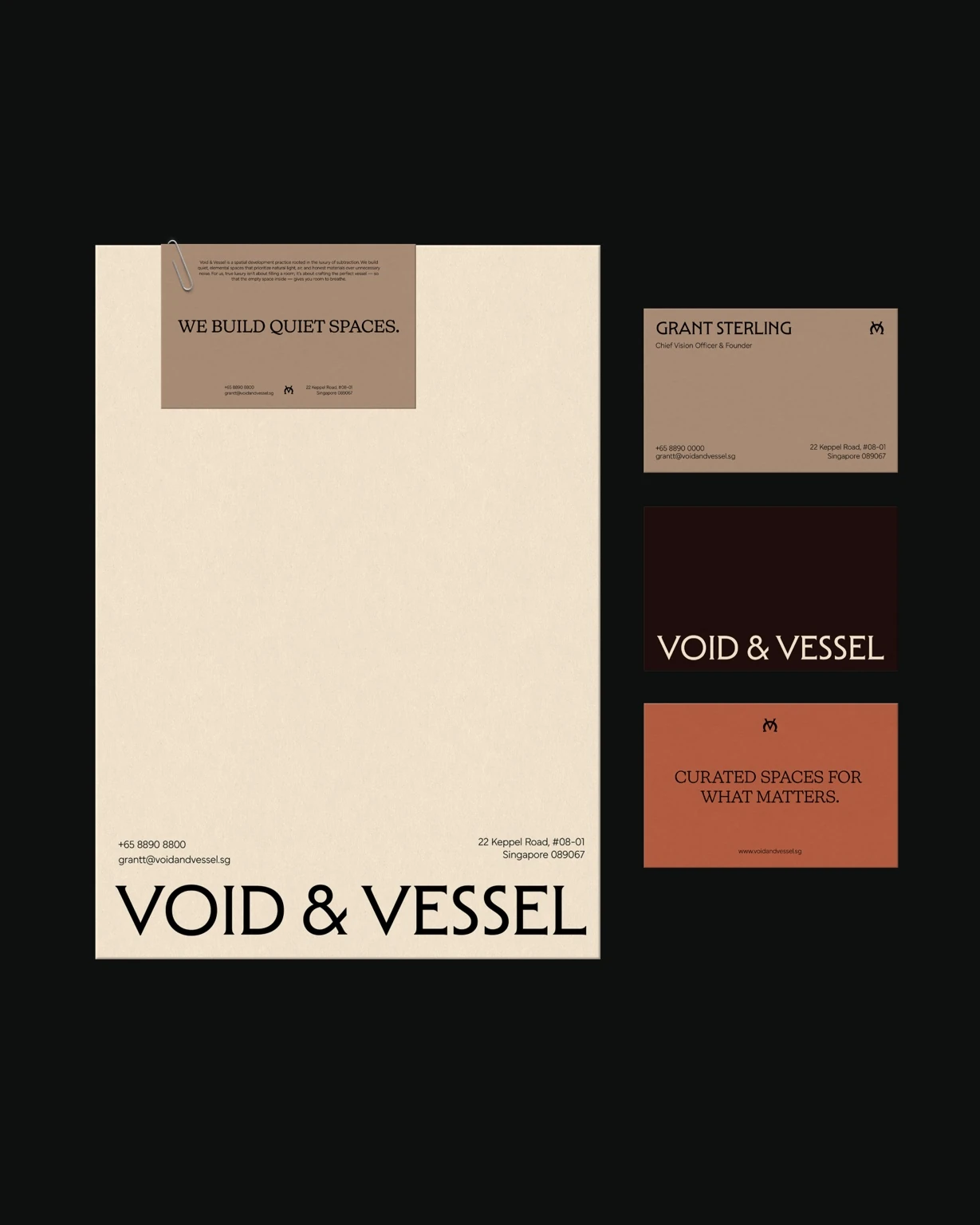
VOID & VESSEL is a spatial development practice built around quiet, elemental spaces. Natural light, air and honest materials take priority over unnecessary noise. The brand identity translates that philosophy into a visual language that feels as considered as the spaces it represents.
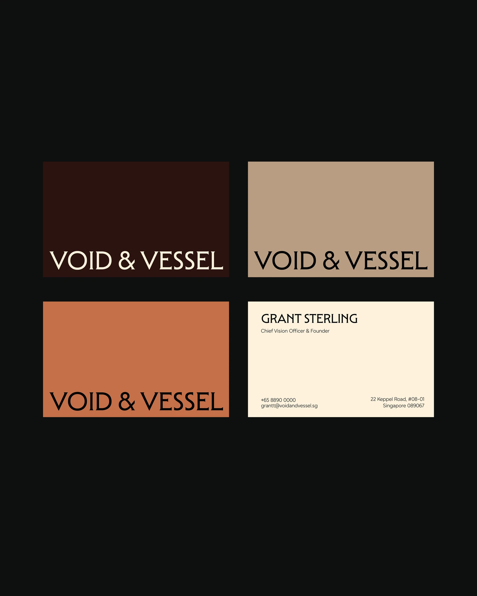
The idea is simple: give what matters room to breathe. A sculptural serif wordmark and compact monogram bring character, while warm cream, oat, terracotta and deep brown suggest a tactile material palette. Generous negative space carries the same sense of calm across print, digital and environmental applications.
01 / BRAND IDEA
A quieter kind of presence.
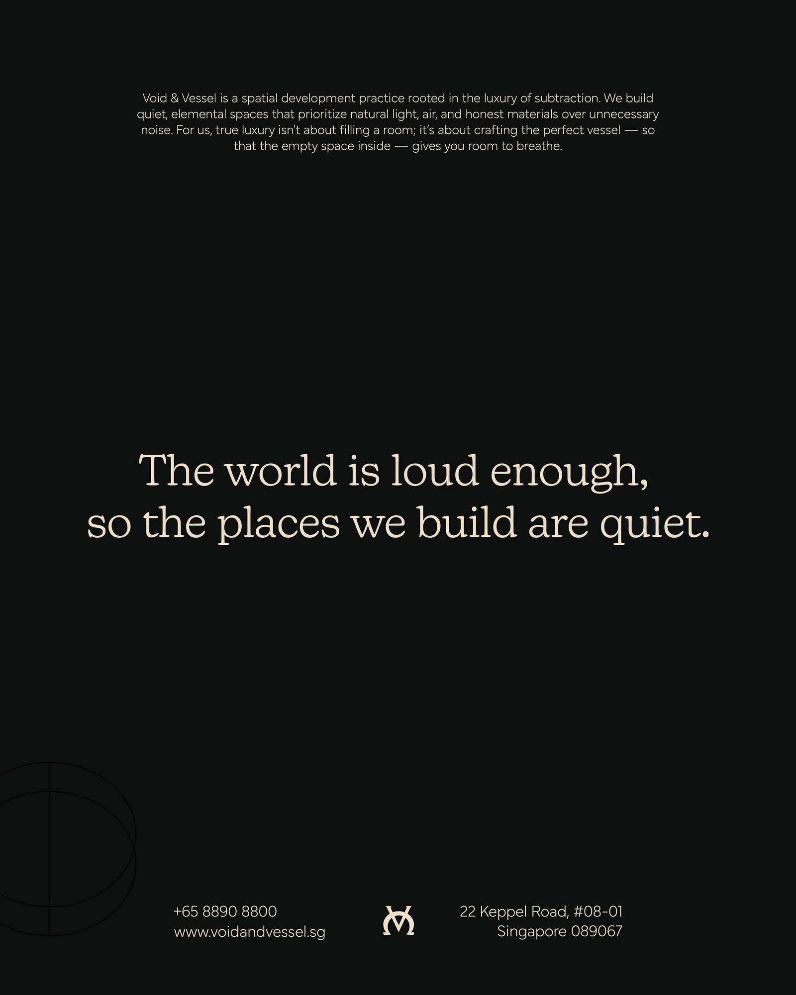
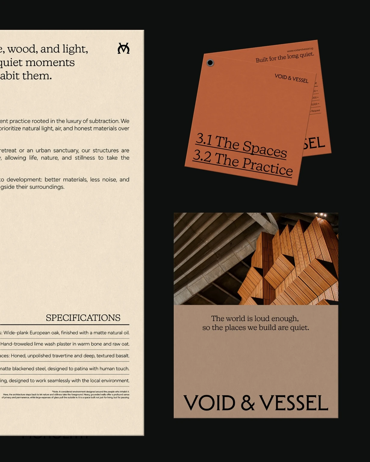
“The world is loud enough, so the places we build are quiet.” This thought anchors the brand voice and visual direction. Expressive letterforms give the name a distinctive presence; open layouts and a grounded palette let that presence feel calm and assured.
02 / PRINT & MATERIAL
A philosophy you can hold.
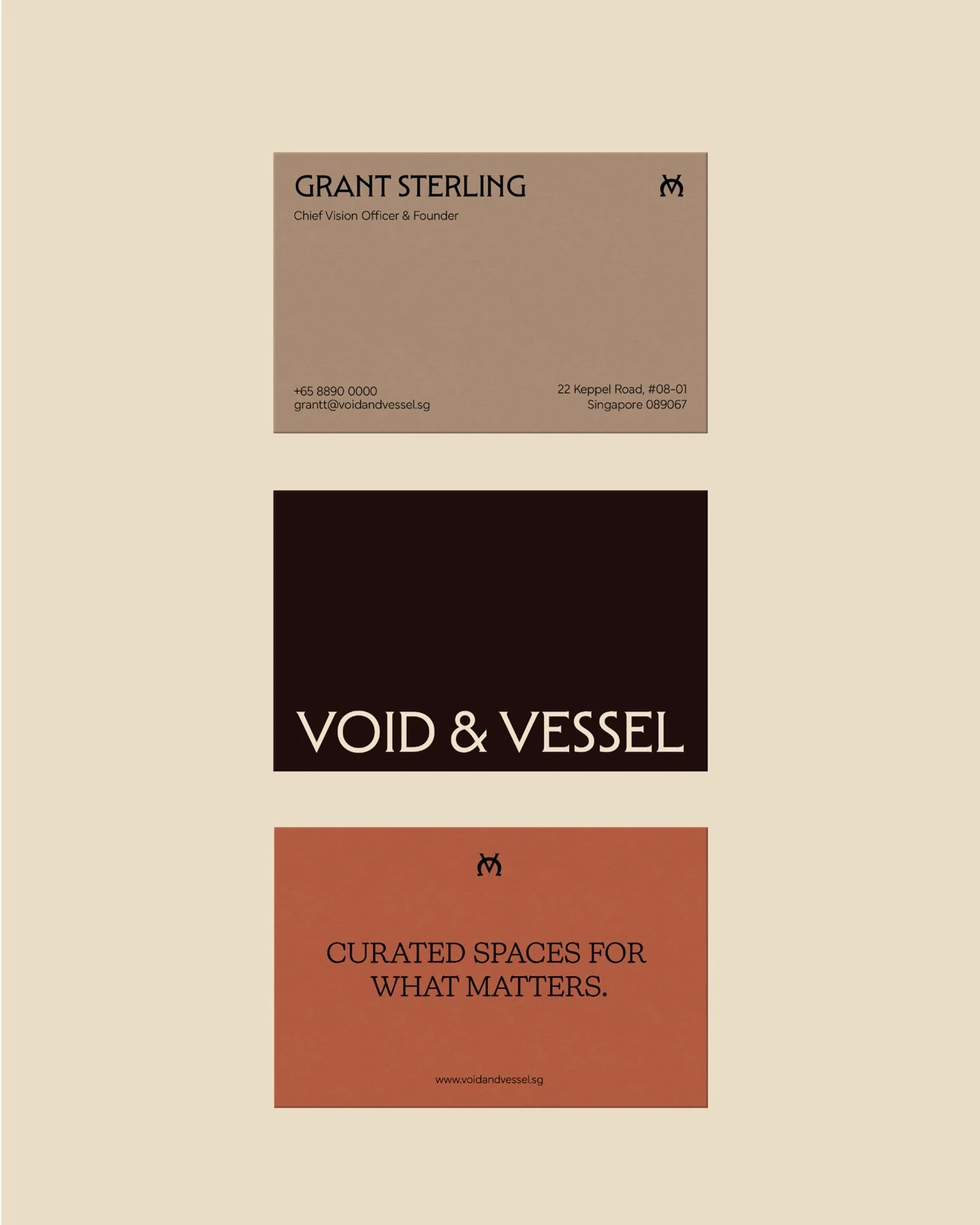
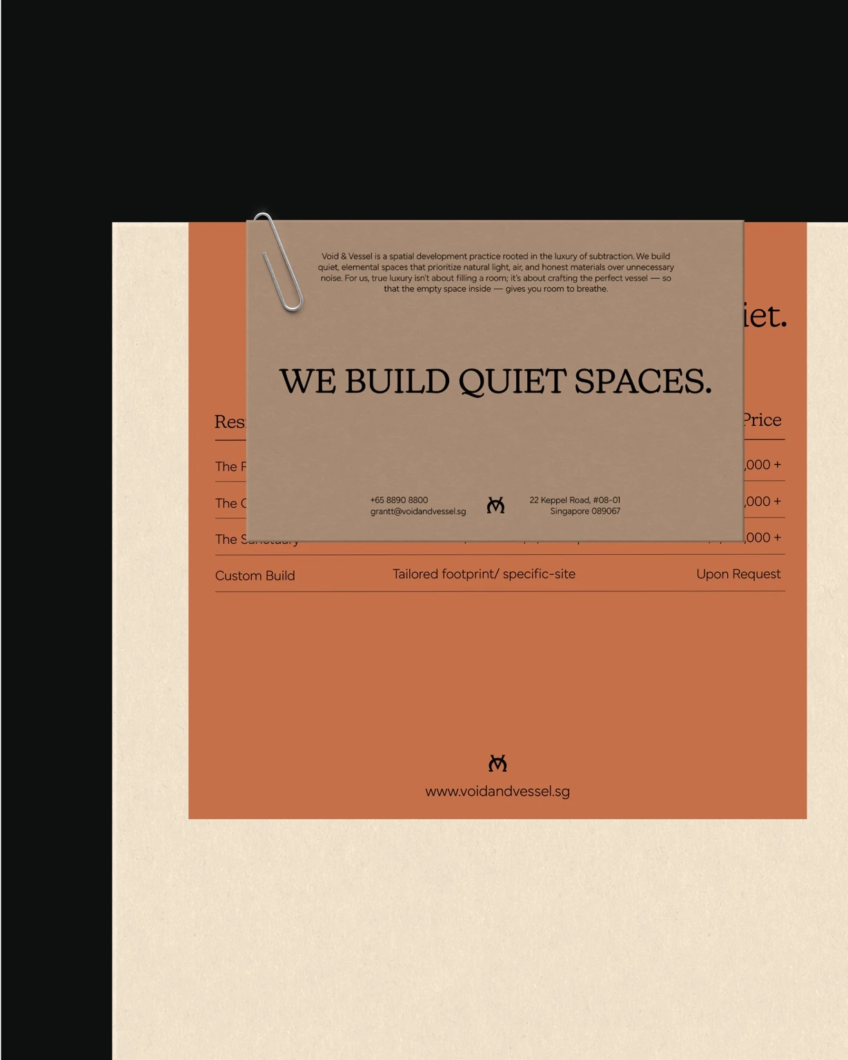
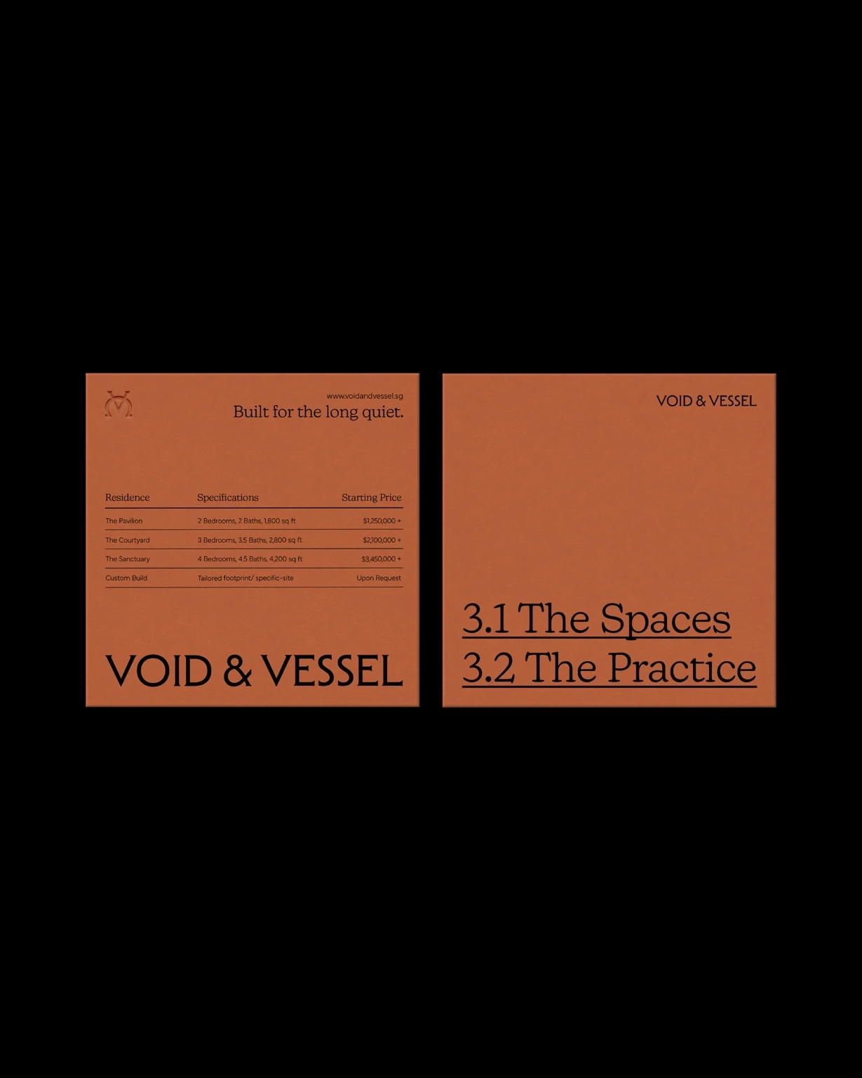
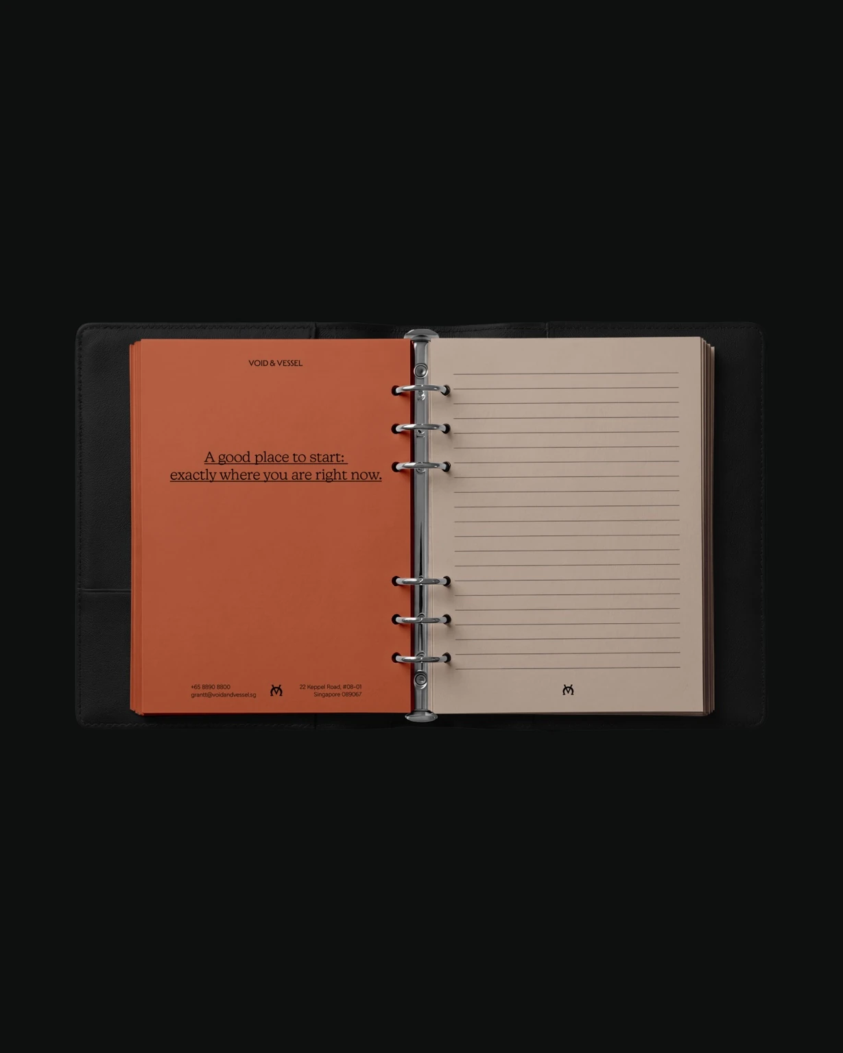
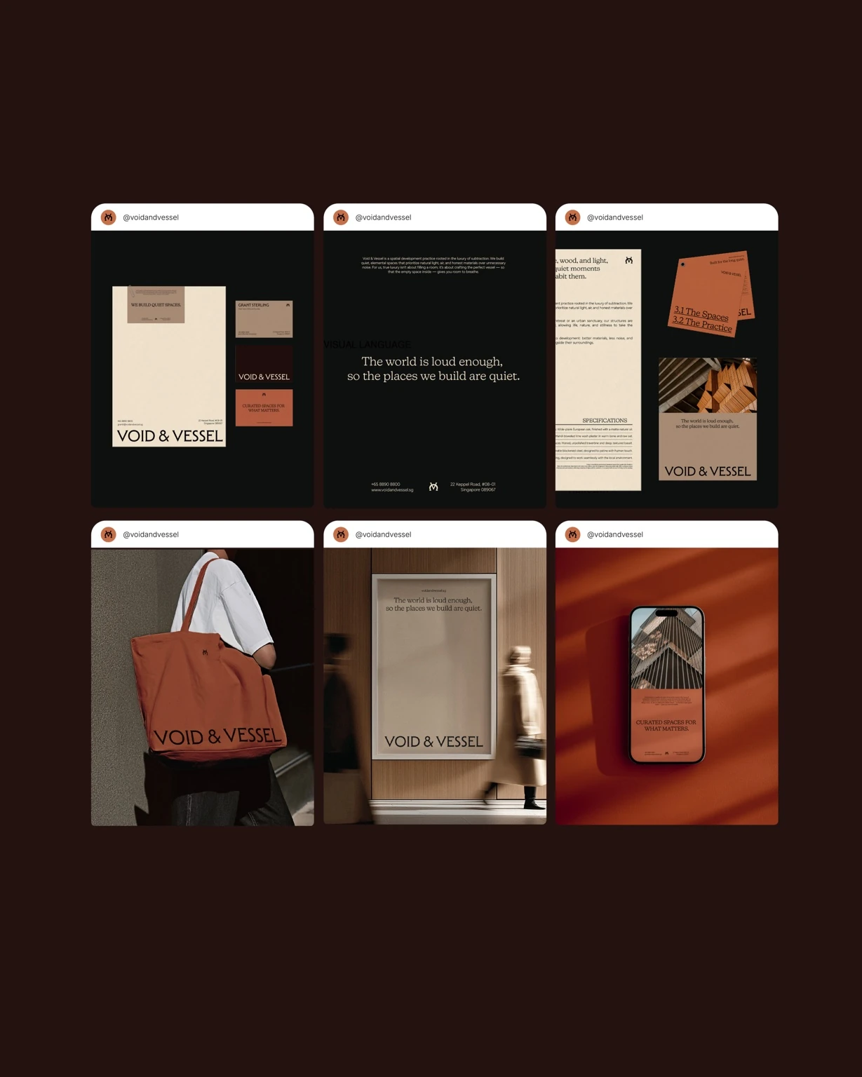
The identity takes on a tactile quality through business cards, practice information, specifications and stationery. Clear hierarchy balances expressive headlines with practical details, while the earthy colour system connects each piece without making every layout feel identical.
03 / DIGITAL EXPERIENCE
Space to explore.
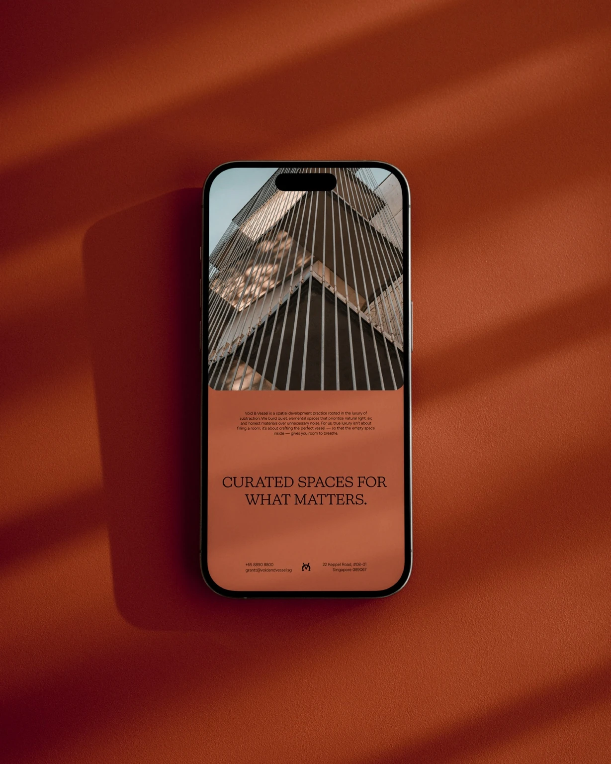
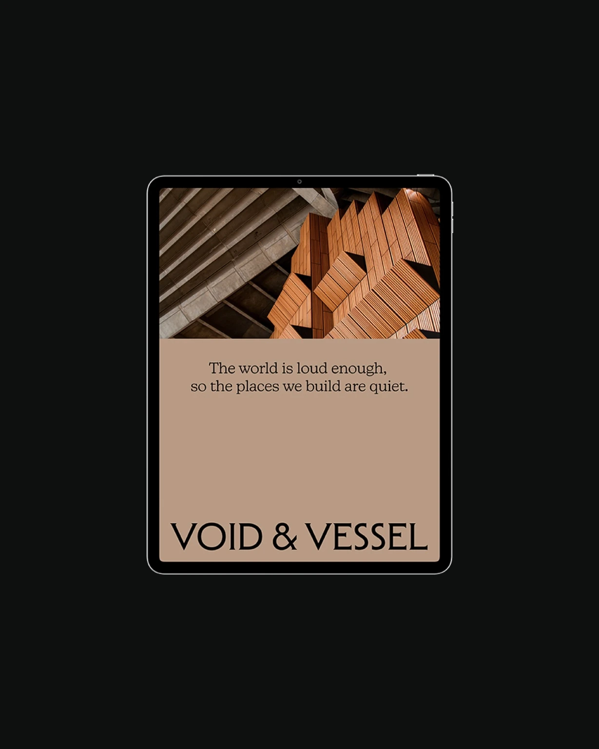
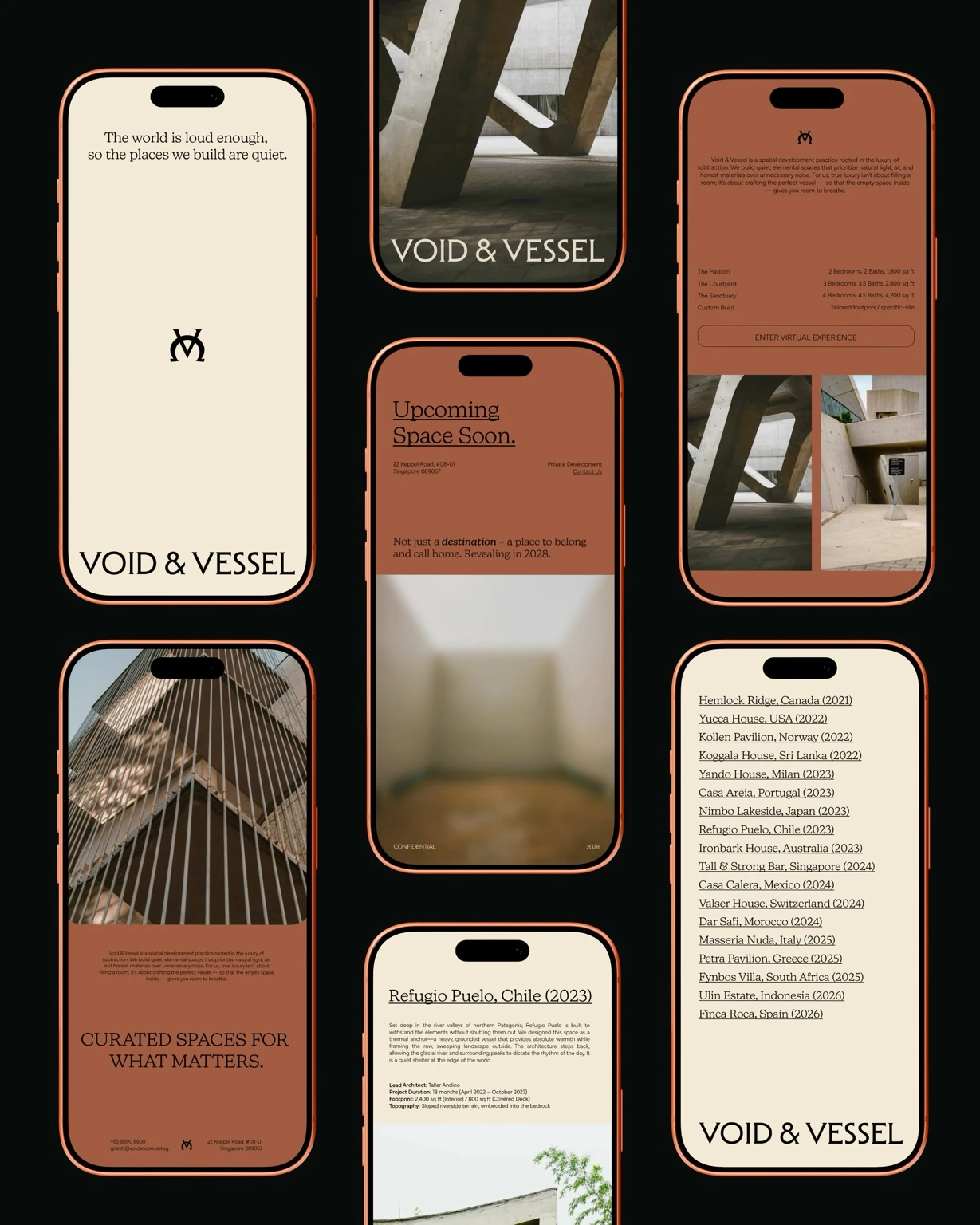
The same principles guide the digital layouts: clear typography, purposeful spacing and architectural photography. Cream and terracotta surfaces create a consistent rhythm as the practice, its philosophy and its spaces unfold across mobile and tablet presentations.
04 / ENVIRONMENTAL EXPRESSION
Quiet words. A confident scale.
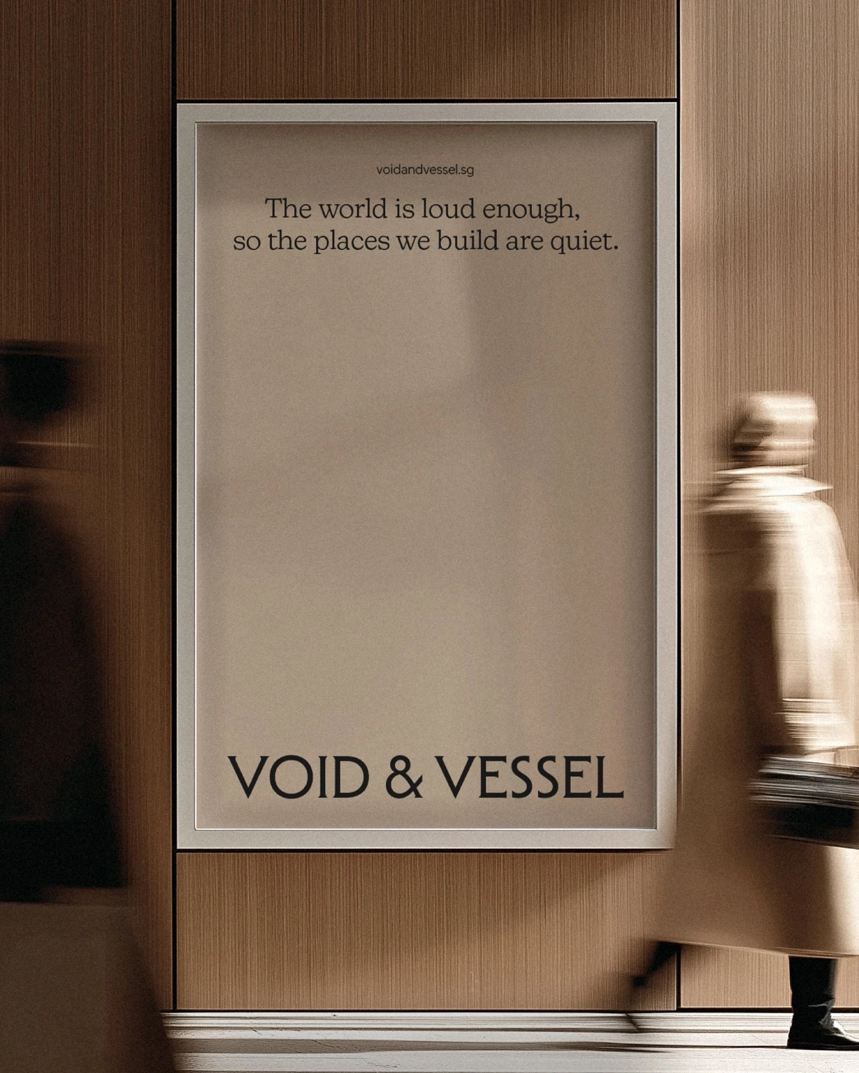
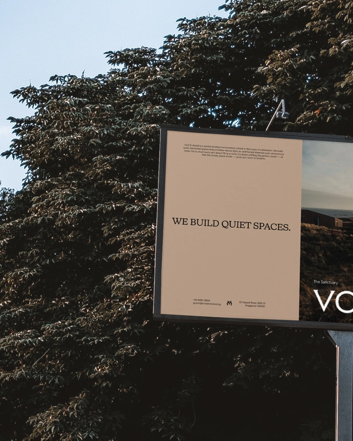
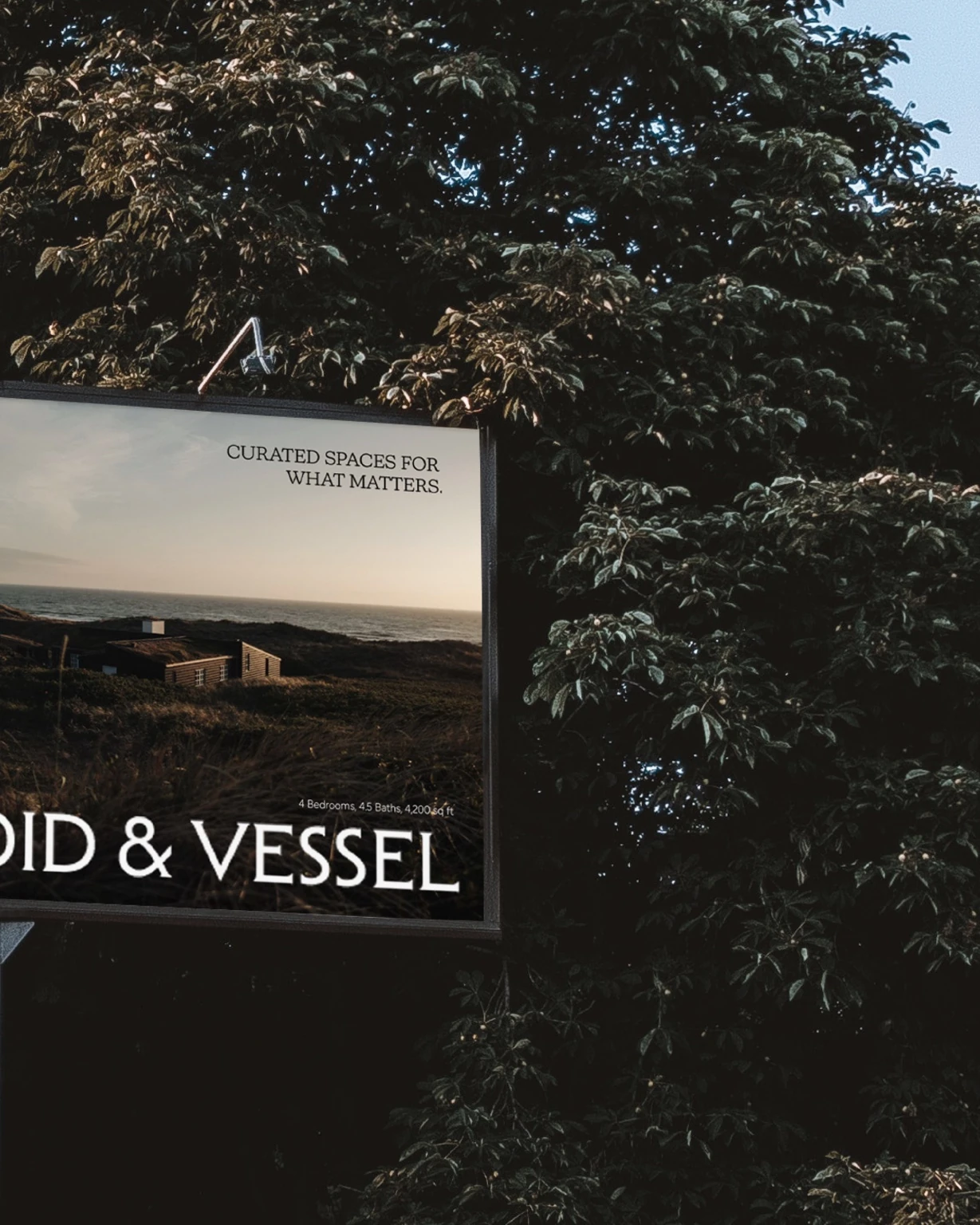
Posters and outdoor applications let the brand speak with very few elements. A concise message, a strong wordmark and considered imagery make the philosophy legible at scale, bringing the identity into the environments people move through.
05 / EVERYDAY OBJECTS
Designed to be carried forward.
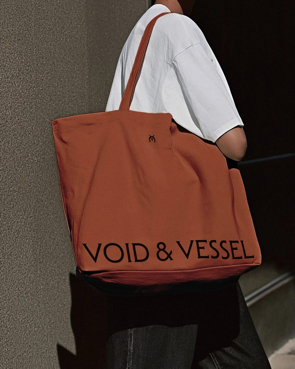
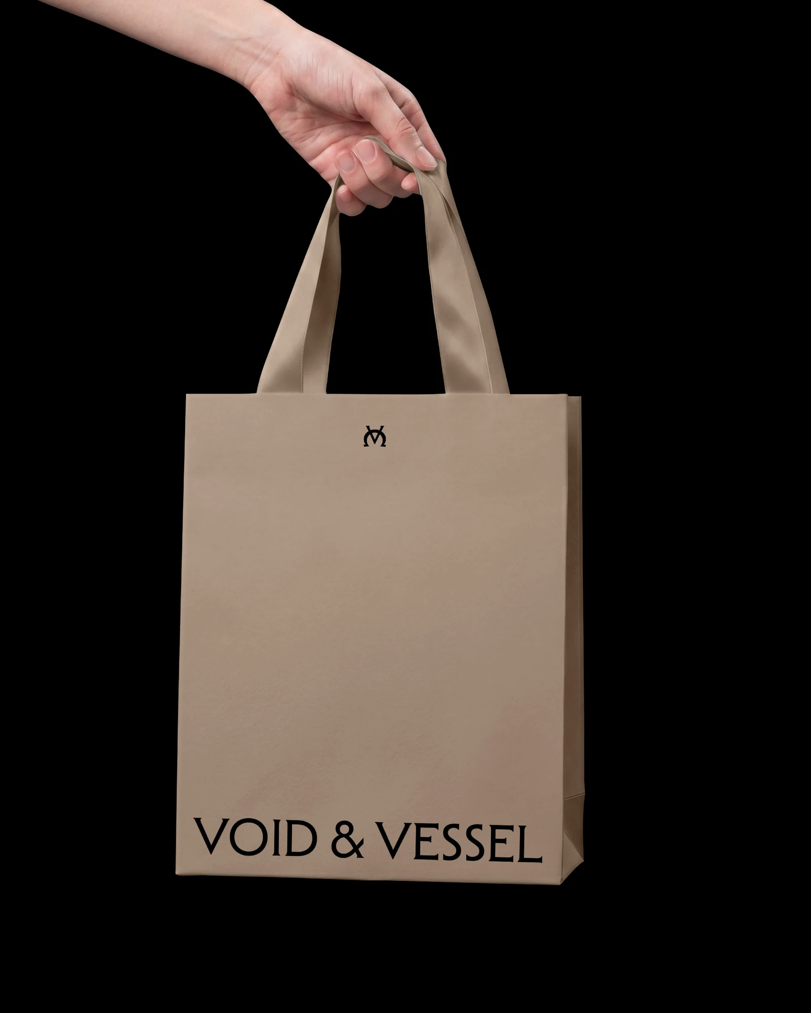
Canvas totes extend the system into everyday use. The compact monogram and oversized wordmark work at different scales, creating a recognisable signature on both warm cream and rust fabric.
06 / EDITORIAL & SOCIAL
One idea, many expressions.
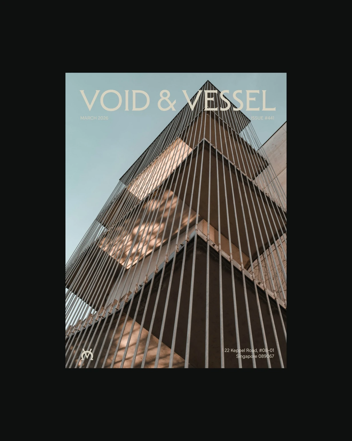
Publication and social layouts bring the pieces together. The identity stays coherent through its typography, palette and use of space, while allowing photography and content to shape each composition.
YOUR NEXT CHAPTER
Give your business
a brand of its own.
Explore our packages or tell us what you have in mind.